✽ Modern Biz
Modern Biz is a marketing and technology blog as well as a creative design showcase. The site's goal is aimed at curating high-quality content and distributing it across various platforms.
Strategy
Branding
UI / UX
Content
Mobile
Challenge
When the client reached out for assistance, the company had already built up a big repertoire of online content over the years. Previously he had used a simple Wordpress theme, which didn’t fit the needs of the website anymore. The main challenge was to restructure the content and replace the old version with a versatile framework that would stand out. To achieve this the platform had to be reshaped fundamentally while still maintaining the connection to the original look and feel.
01
╱ Brand Strategy
Crafted a unified brand
Crafted a fresh, more immersive, and inspiring brand persona that's both beautiful and impactful.
Modern Biz’s visual identity needed to align with their corporate narrative. Created a fresh modern visual identity that is inspiring and approachable. Every design element was designed with the intent to support Modern Biz’s brand narrative and appeal to current and future customers. A style guide was created to allow the design system to remain consistent across people and teams.
━━
Focus on Engagement
Rich Content Pages
Eclectic Editorial Layout
Community Involvement
Defining the Brand
Visualizing the brand attitude.
Modern Biz has a playful, upbeat vibe that needed to be enhanced but the platform also had to be perceived as highly professional. Nevertheless, content is never boring but entertaining and makes the young audience stay curious. Modern Biz is real and original, providing information in a fun way.
Simple & sleek styling
Simple lines, vivid colors, and contemporary styling were the three main guidelines when designing the brand identity for Modern Biz. The brand was designed to look contemporary and minimalist, just like the blog itself.
⎯⎯⎯Logo
Minimal doesn't need to be plain and subtle. A bold serif typeface title will make a strong impact when used in a modern and clean design.
More than a simple blog.
With the new design approach, Modern Biz developed into an authentic, unique platform that reached users on an emotional level. The new structure improved content discovery, readability and user engagement.
⎯⎯⎯Homepage
With blog articles being a priority, the landing page architecture served the purpose of displaying a diversity of various content pieces. This allowed users to easily browse and explore a wide range of topics and remain engaged.
Clean & modern layout
Built a design system that leverages clean, open layouts to house the rich content throughout the site, presenting key pieces of content in a more digestible way. This also provides a more guided experience online, with clear call-to-actions and global elements that help users navigate from page to page.
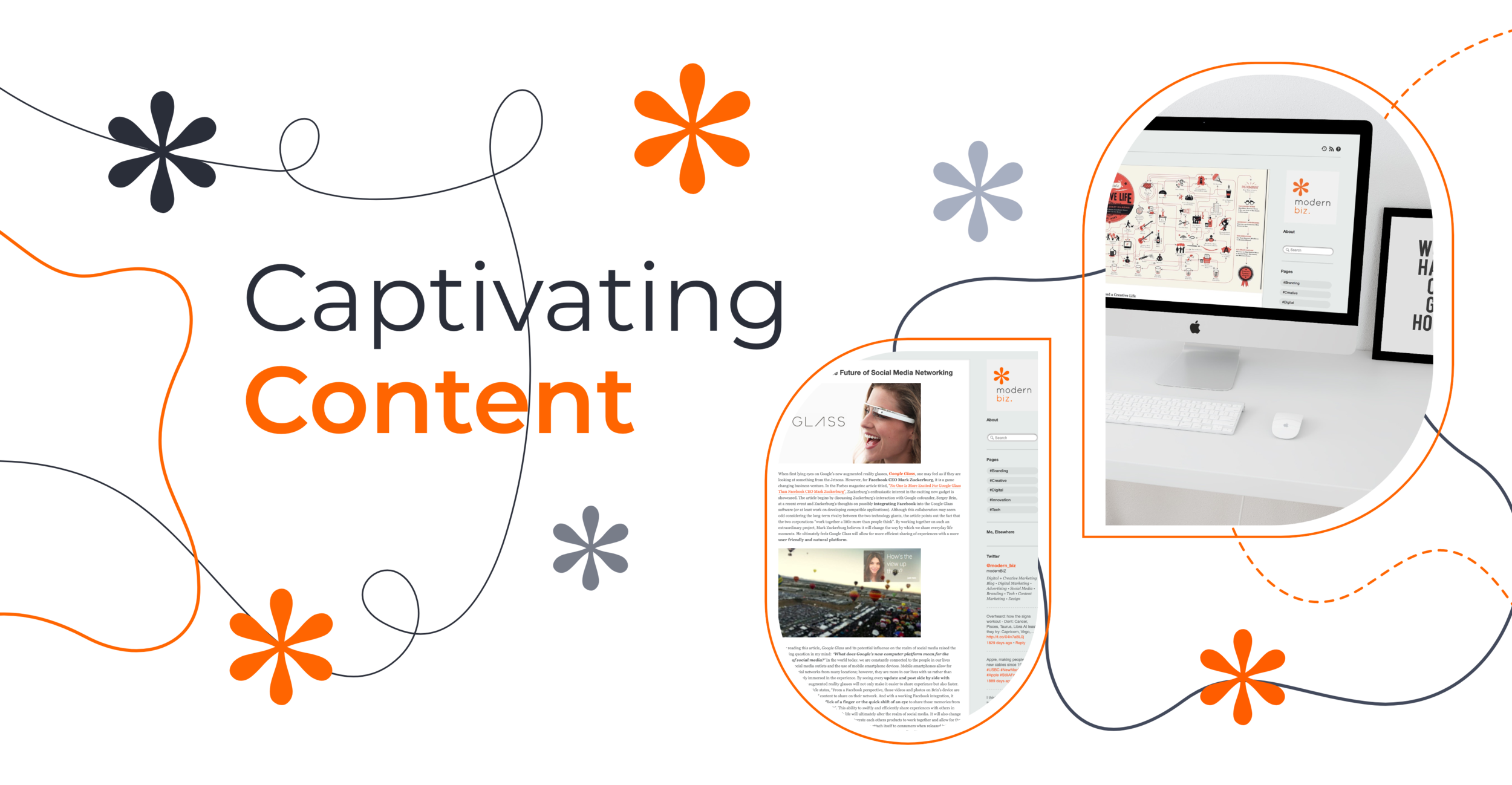
Crafted for captivating content
The main goal of the website was to focus on content distribution and highlight important media. As a result, layouts were carefully organized so the website would be fully optimized to distribute content.
⎯⎯⎯Fresh digital content, delivered daily.
The blog at the start before AR Digital Design took over was pretty basic. As a result, we had to overcome a number of technical challenges to include the features we wanted.
A custom-tailored experience
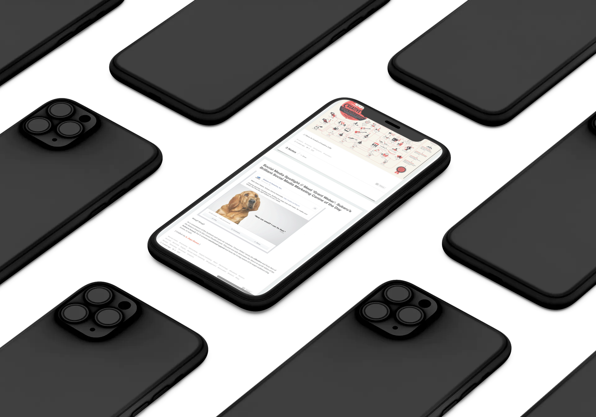
A new navigation concept, a modular layout structure, and innovative blog features improved both the content discoverability and the general reading experience.
⎯⎯⎯UI Elements
Visual content blocks
Gallery slideshows
Embedded videos
Product cross-linking
Enhanced Mobile Experience
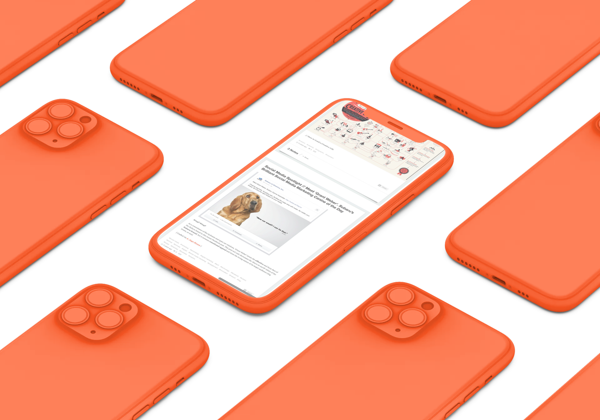
A custom grid system enabled a seamless cross-device experience. The mobile experience was especially important because of the young target audience who primarily used mobile devices.
⎯⎯⎯
Optimized content strategy
When we started working with Modern Biz, their site had a high page count. Based on website analytics and user research we cleaned the slate and built a new IA from the ground up. At the same time, we created a content strategy centric sitemaps that outlined the purpose of each interface based on Modern Biz’s business goals and customer needs.
⎯⎯⎯Layout & Structure
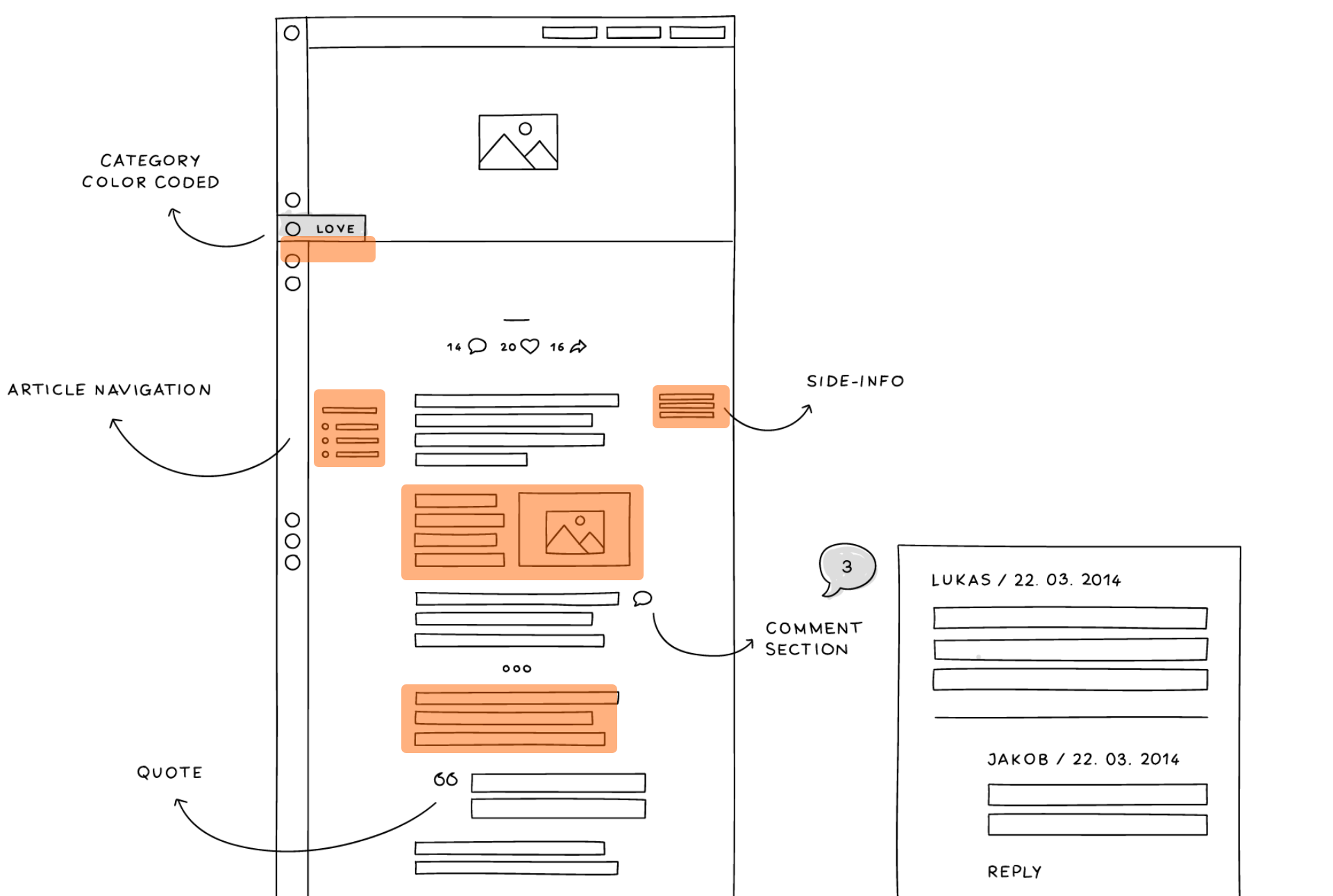
Designed to maximize content viewing and allow for easy sharing across social platforms. User experience is seemless and allows the site visitors to effortlessly browse content.
─
Article pages needed a strong visual hierarchy and a high level of readability.
More Case Studies
⎯⎯⎯⎯⎯
Let's build something amazing.
Ready to launch your brand to new heights?
Get in touch via the button below and take a minute to talk about your project.
Let’s talk ➔

