Tots Bistro is a New American specialty restaurant in Boulder, Colorado offering innovative and gourmet options to the classic tater tot.
Projects
Innovative Design, Marketing & Technology Case Studies
Tots Bistro is a New American specialty restaurant in Boulder, Colorado offering innovative and gourmet options to the classic tater tot.
Boasting a consistent and current presence in the media, Casselman's is a staple in Denver nightlife and remains one of the city’s most prominent live concert venues. With over 10,000 square feet of event space in the trendy RiNo district, Casselman’s is more than just a bar. It's also an ideal destination for a robust meal, a concert or a private party.
GIF Design Showcase
2 Red Hens offers beautiful products for Mother and Baby – from trendy diaper bags to innovative products that solve some problems that come with parenthood.


Expand brand awareness and establish online presence.
Redesign and develop new e-Commerce website with new brand identity.
Increase brand awareness using social media channels and direct traffic to website.
Create a clean, simple, and elegant brand identity.
Design a beautiful, bespoke responsive eCommerce website.
Increase leads and sales via digital marketing and strategic landing page design.
Crafted a comprehensive visual identity.
Developed a unique brand experience that reflects the core essence of the 2 Red Hens brand.
Expanded brand outreach through various online media channels.
Comprehensive care was given to create this new visual identity for Red Hens. The clients initially called in with a request for a new brand identity and development began immediately on a complete brand system.
Told the Red Hens brand story through a bold new identity & a robust online experience.
"Vintage-style" doesn't have to be tiresome and boring...a traditional serif typeface, when paired with a contemporary design, creates a powerful impression. By adding a modern touch to the preexisting "vintage chic" persona of the brand, a new tone was created that really set them apart and positioned them well for growth.
━━
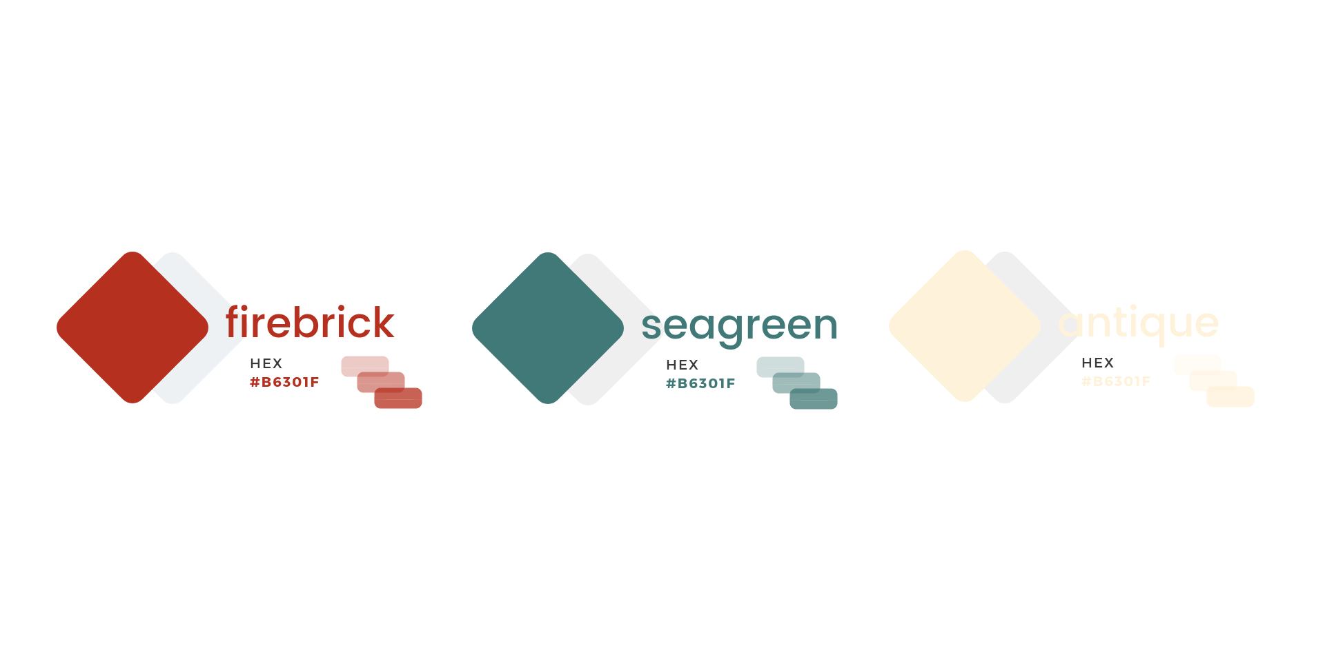
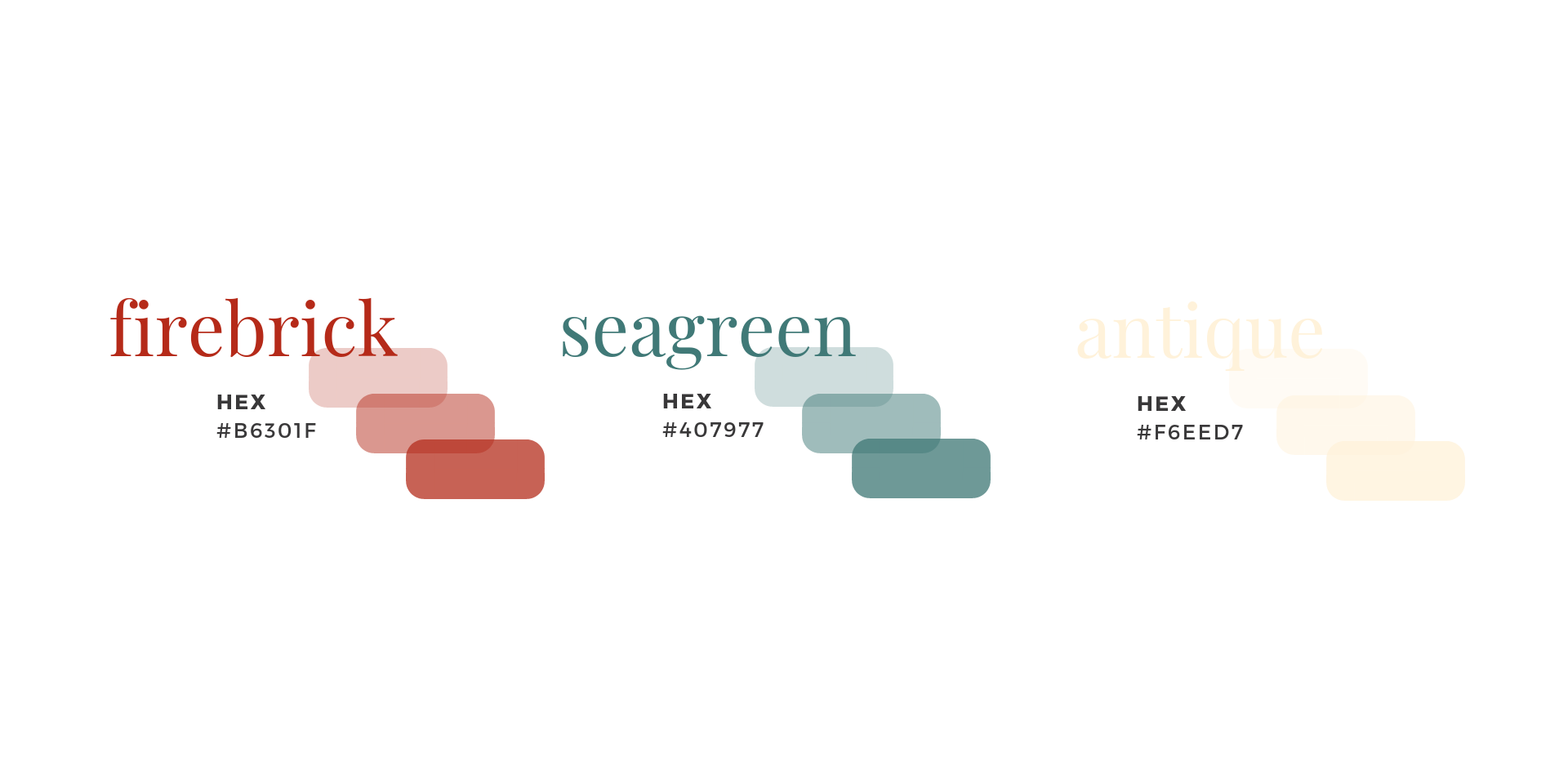
Lured in customers with remarkable content. Spread benefits and attracted new visitors and leads to the brand through valuable and consistent strategic content marketing.
─

Engaging with consumers online means having a conversation. It means providing branded content in real time that's alluring. By designing a comprehensive social media engagement strategy and creating captivating content, we were able to connect the 2 Red Hens brand with their target audiences and built lasting credibility.
Being successful in social media requires strategic planning that focuses on amplifying engagement, broadening audiences, and positioning brands in the market. In result, strategic planning was implemented to build awareness, increase the loyalty of the brand community, and drive eCommerce sales.
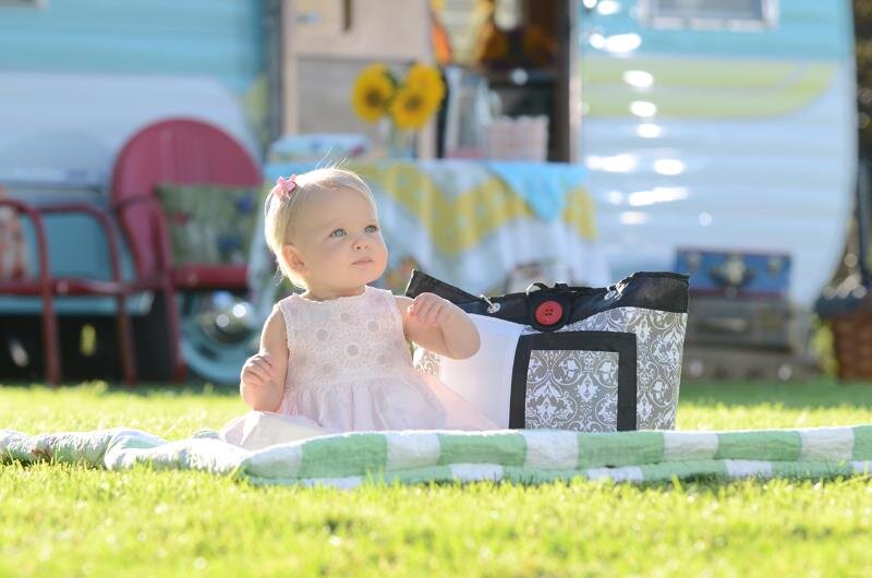
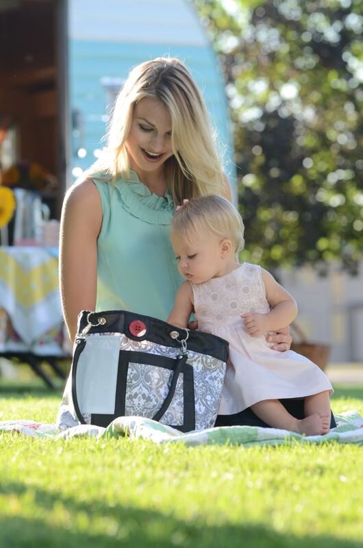


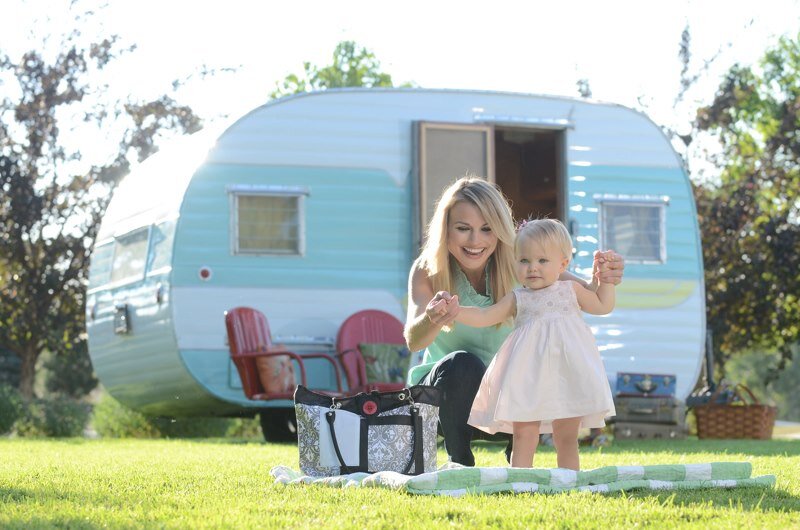


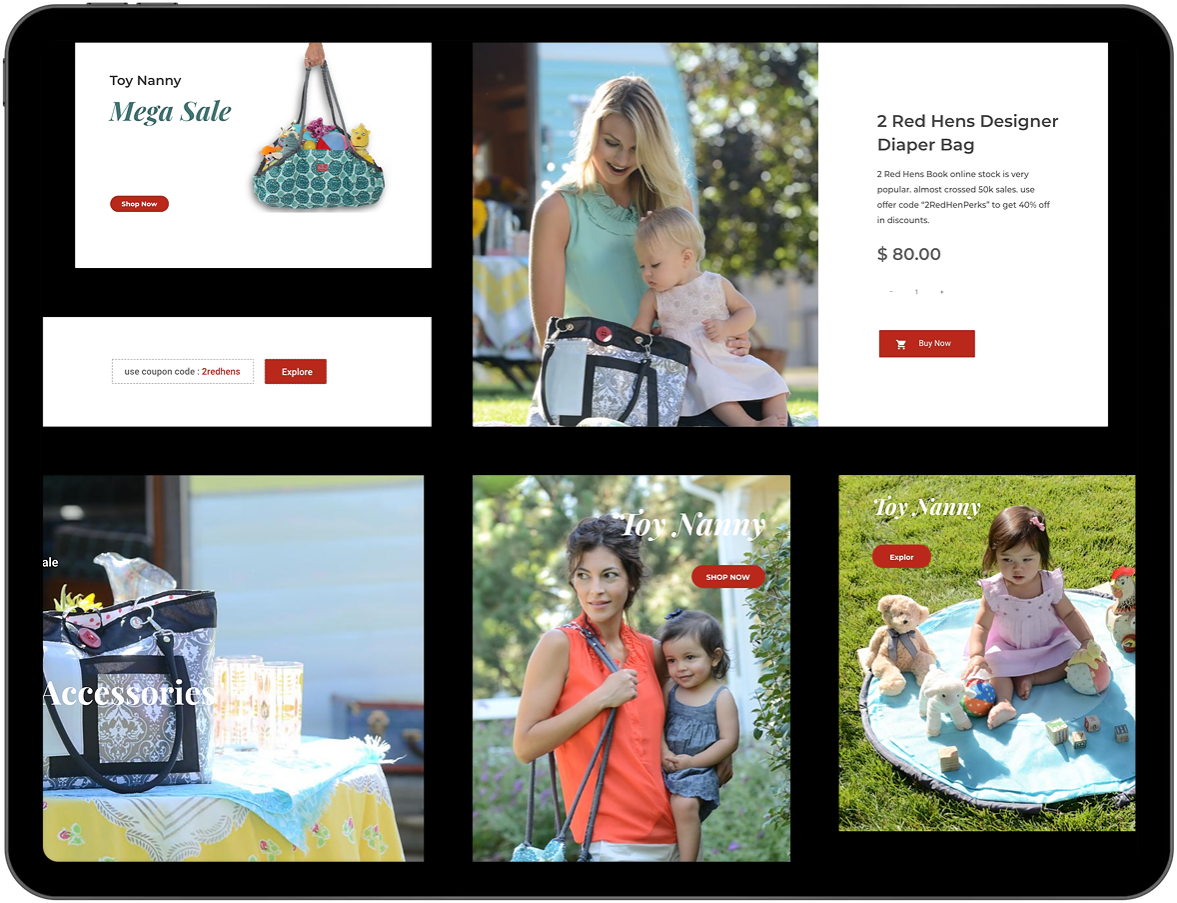
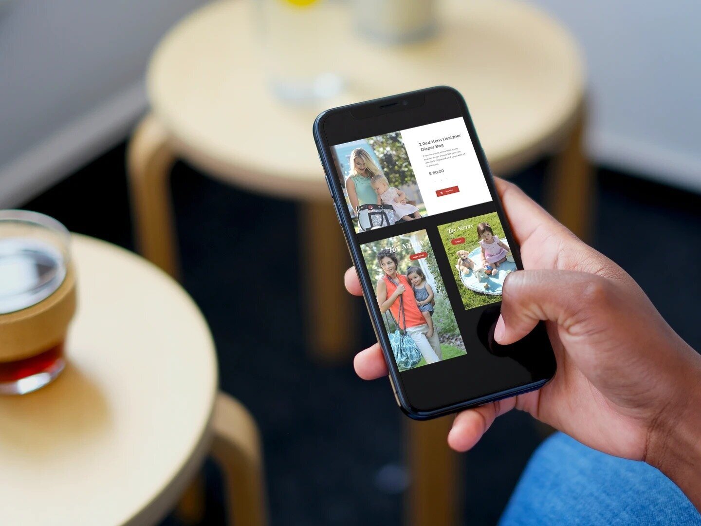
Crafted for the digital world.
Established two main goals for the website: increase conversions and demonstrate high-end design in engineering. In an effort to build a better-informed strategy, a site audit was performed on several consumer fashion manufacturers who emphasize strong design. This research step provided insight into what seemed to work, as well as what didn’t, in featuring technical aspects of top-tier products. We used a very clean design and subtle movement to highlight the aesthetic appeal of each featured product.
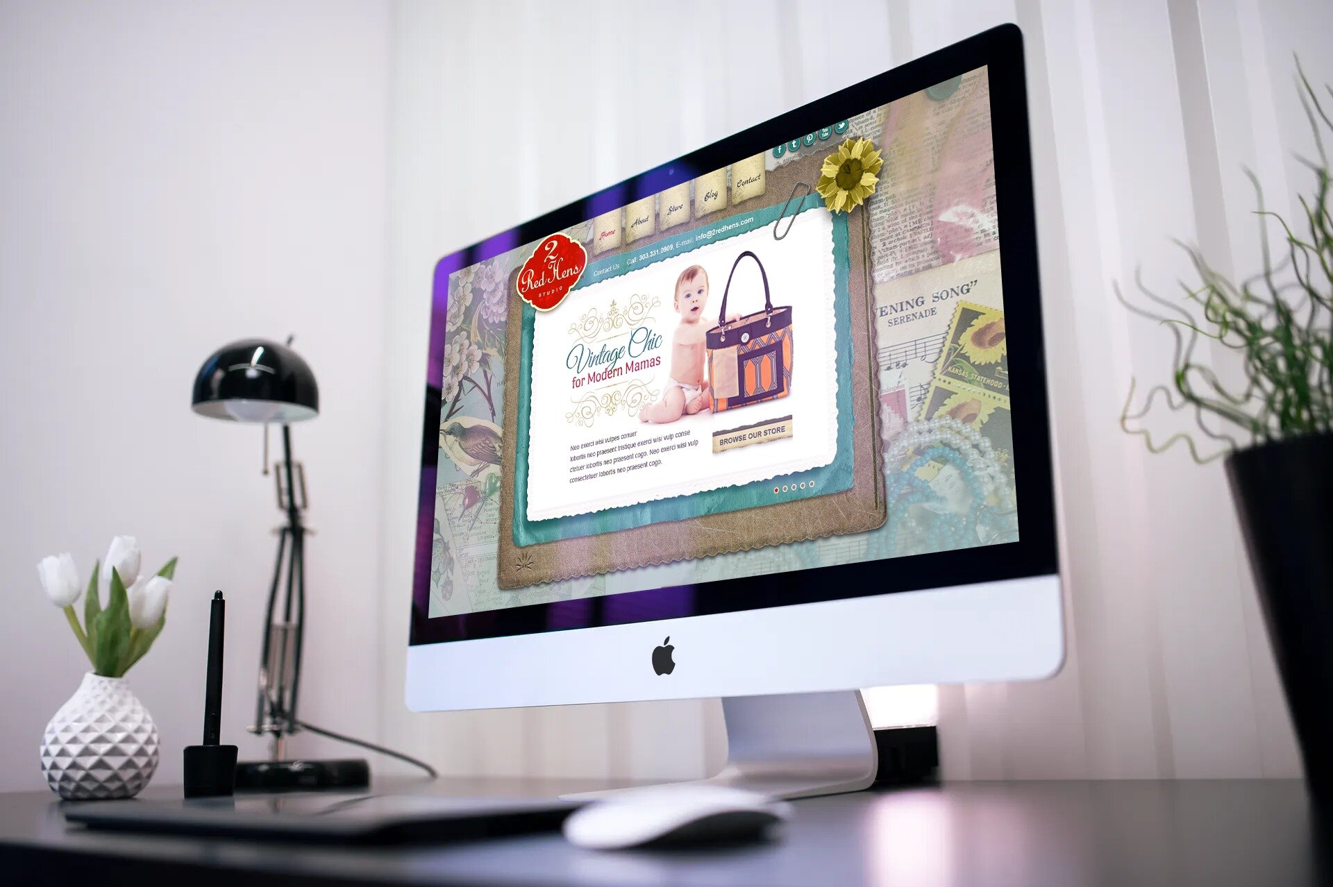
Modern interface meets
classic style.
Established two main goals for the website: increase conversions and demonstrate high-end design in engineering. In an effort to build a better-informed strategy, a site audit was performed on several consumer fashion manufacturers who emphasize strong design. This research step provided insight into what seemed to work, as well as what didn’t, in featuring technical aspects of top-tier products. We used a very clean design and subtle movement to highlight the aesthetic appeal of each featured product.
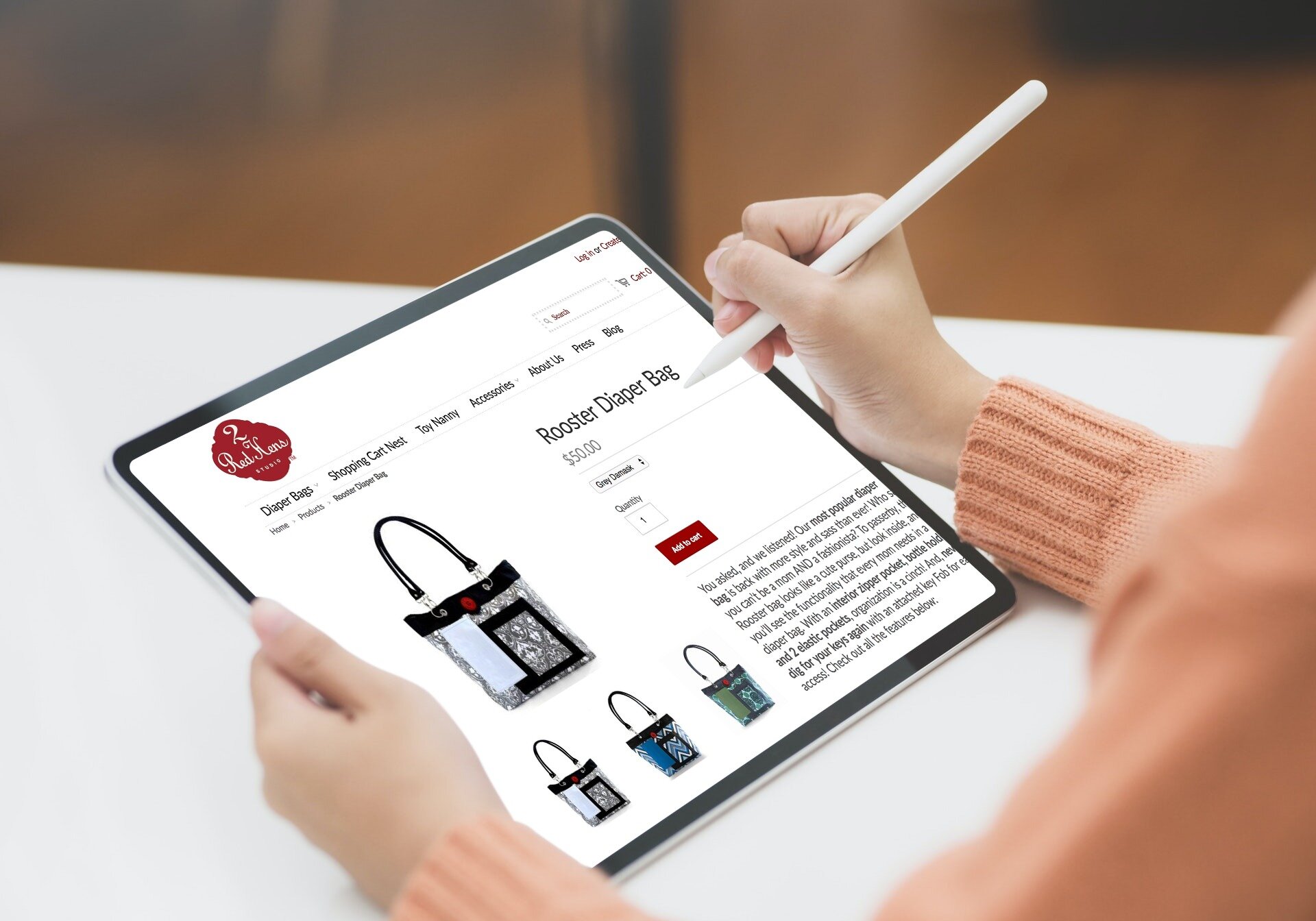
Crafted a new, more immersive and inspiring e-Commerce experience that's both beautiful and impactful on the user.
Crafted user experience to showcase the brand, incorporate eCommerce best practices, and build a streamlined shopping experience. Included high-quality images so that shoppers will be able to visualize and see the details of the products. In doing so, the versatility of Red Hen’s products was highlighted.
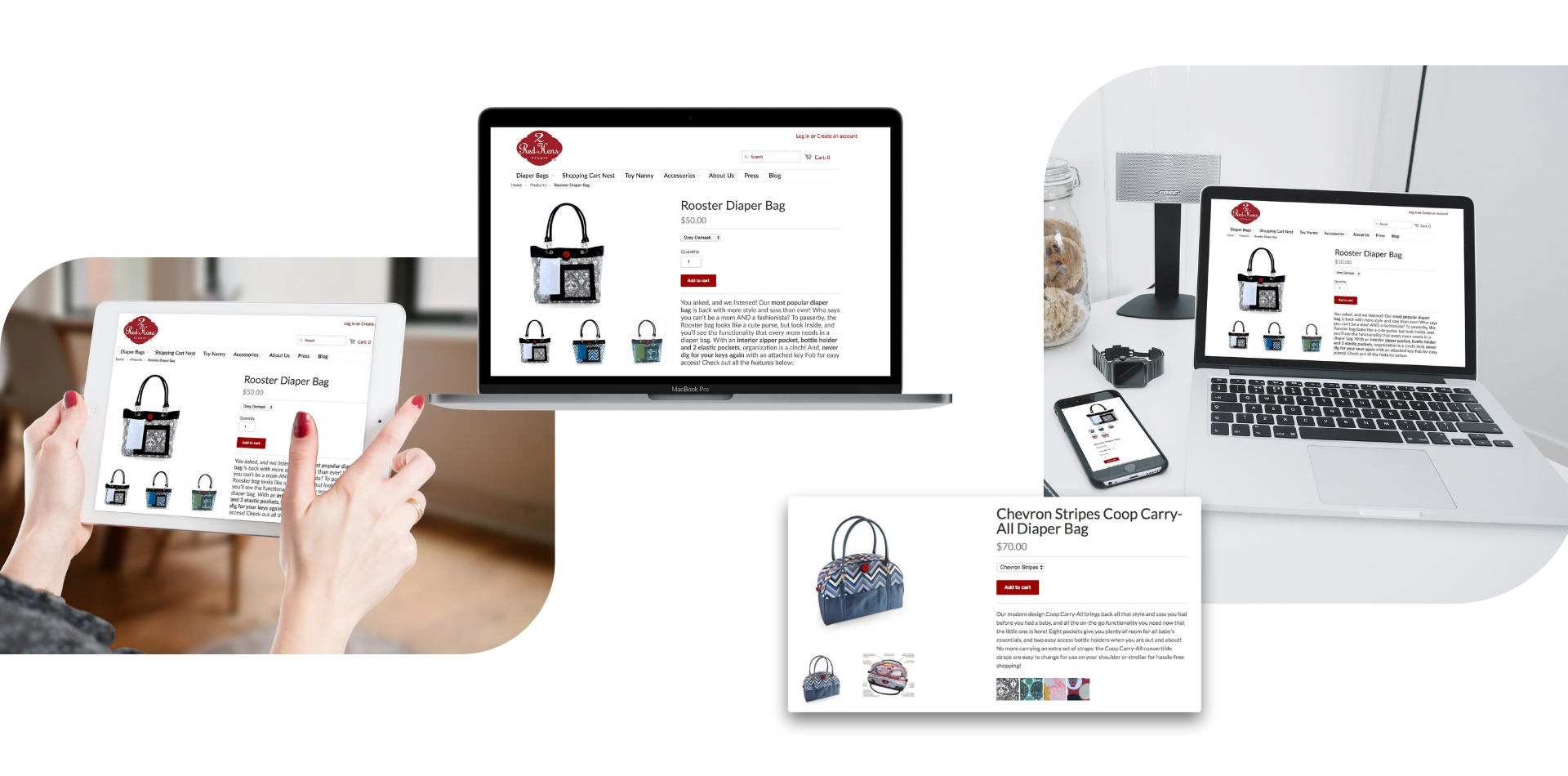

Effective eCommerce begins with a finely tuned navigation, a welcoming user experience & eye catching online merchandising.
Strategically added various eCommerce specifc features (similar to that of Shopify) to boost sales and peromance on the site.
Lifestyle merchandise photography
Personalized banners for unique appearance
Search engine optimized landing page
Dynamic product cross-linking
Blending product & lifestyle imagery
Featured product spotlights
The UX strategy was driven by the goal of opening a conversation with consumers and hooking them onto the brand. The website concept consists of a modular system to remain flexible for future iterations.
─
━━
Built a strong digital presence that included both brand engagement as well as a powerful eCommerce solution. For instance, a combination of social media content, crafty imagery, and honest storytelling was utilized to continuously inspire and empower the target audience.
"The website tells its story beautifully and concisely via immersive content and a delightful user experience, and, in so doing, educates the consumer quickly and significantly on what the brand is all about."
AJaye Ranes
─────────
Founder @ AR Digital Design

What does it mean to focus on the customer experience of eCommerce? One contributing factor is how we present the product throughout the user journey from browsing to purchase. The e-Commerce site's product listing and product detail pages are designed to provide context and motivation through original creative content, such as videos, trends, collection call-outs, and branded imagery.
━━━


Crafted a new, more immersive and inspiring e-Commerce experience that's both beautiful and impactful on the user.
Crafted user experience to showcase the brand, incorporate eCommerce best practices, and build a streamlined shopping experience. Included high-quality images so that shoppers will be able to visualize and see the details of the products. In doing so, the versatility of Red Hen’s products was highlighted.
The UX strategy was driven by the goal of opening a conversation with consumers and hooking them onto the brand. The website concept consists of a modular system to remain flexible for future iterations.
Bold, effortless mobile layouts power engagement and brand appeal. The mobile experience is simple to use while keeping the integrity of the desktop’s immersive and engaging atmosphere.


Think we might be the right friends for your next adventure?
Take a minute, we’d love to hear about your project.
Memory Lane is a vintage salon and bridal boutique that offers a variety of beauty and wedding services. Memory Lane’s entire website was redesigned from the ground up based on the insights discovered in research paired with Memory Lane’s business goals and positioning. AR Digital Design was there every step of the way from planning and content strategy through visual design and site development. As always, Memory Lane’s website was designed to look and work great on any device.
Professional beauty stylist based in Denver, Colorado offering wedding, fashion, and salon services. With a fresh, modern aesthetic combined with a passion for making women look and feel their best, Misty creates hair and makeup styles fit for the runway.
━━

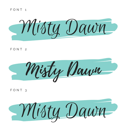
Designed overall brand image, crafted brand guidelines, iconography, logo marks, booklets, and more to ensure that each customer touch point felt fresh. Patterns, icons, typography, and color palettes were designed and selected to reinforce the sophisticated, chic style of the brand.


Fresh and clean with subtle design touches, the website embodies the brand at every click. The initial process was about adapting colors from the initial brand guidelines, imagery, contents and components, translating into digital solutions. It was important that the website really reflected the right aura of Misty and the brand as a whole.


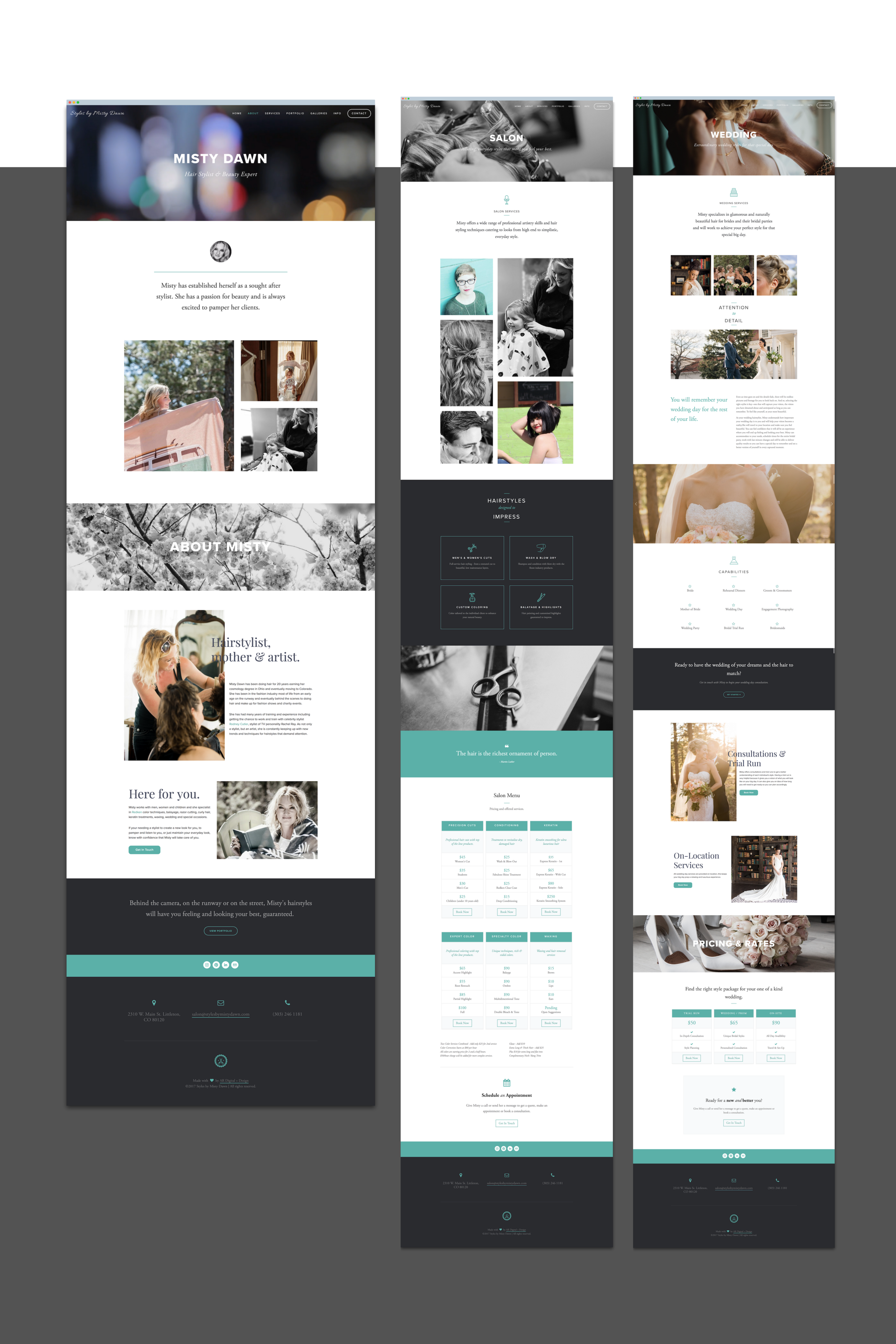
The website showcases beautiful visuals that grab the attention of target consumers and makes the brand pop! In addition to stunning imagery, a content strategy was set for photos and copy - elevating digital brand communication.

It was imperative that the website provide an exceptional user experience on mobile devices, iPads, and tablets. To accommodate this, the site was designed for various platforms.
Built a mobile ready website that's quick, easy and enjoyable while keeping with the seemless, clean design.
Responsive design techniques were utilized that allow the website to adapt to any device, regardless of screen size.
Gallo en Fuego is a men's apparel company, embodies the heroism of Firefighters. Their rugged line of gear for men includes belts and wallets made from decommissioned fire hoses made in the USA.
━━
The challenges for this project were to create a more friendly and familiar tone of voice and to make a better user experience. Also, had to consider the need to improve search engine visibility by designing ideas pages to help the target audience discover the service. from a birdie detail.
The slogan 'Gear with a Past' was created to highlight the use of recycled fire hose in products and celebrate firefighters.
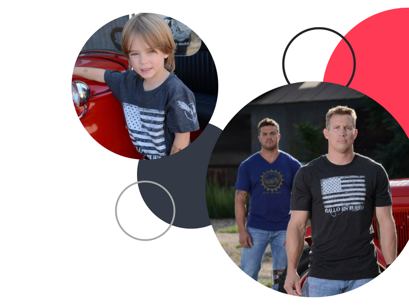
Care was given to create a visual identity that scales and co-brands well. The visual storytelling is evocative and clear to capture the spirit of the Gallo en Fuego brand. Brand messaging focuses on charity, heroism, eco-friendly products, durability, and rugged style.


Designed beautiful, enticing user-interface that grabs the attention of target consumers and makes the Gallo en Fuego brand pop! Producing a cutting-edge design that really had the necessary wow factor was the main priority working with Gallo en Fuego.
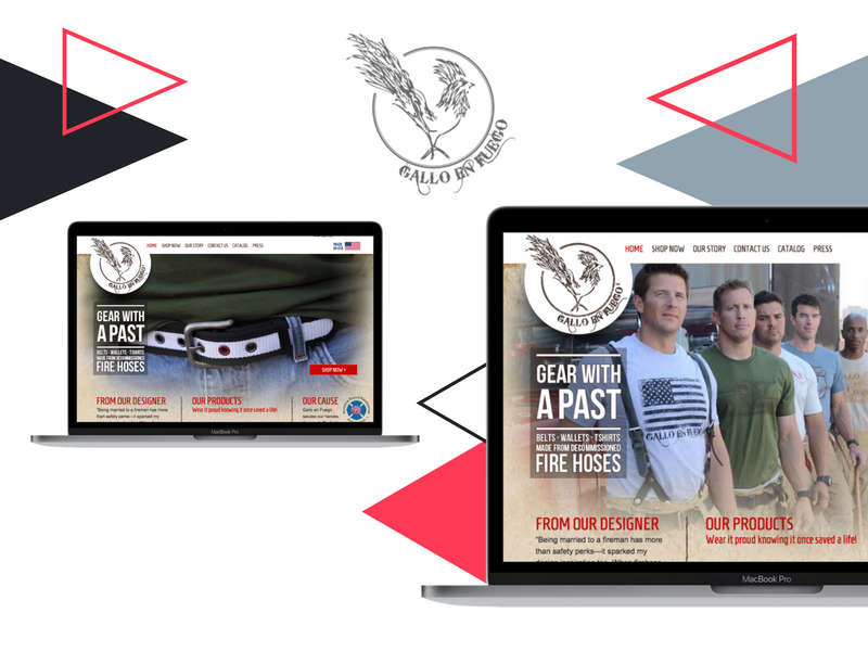
The design experience of the website mirrors Gallo en Fuego's charitable approach to fashion and the rugged styling of each product. Implementing clear interactions with clean design elements, the website seamlessly aligns with the Gallo en Fuego brand and its goals.


In order to promote and launch the Gallo brand, social media campaigns and strategies were implemented across all major platforms. Instagram and Tumblr were utilized to tell the Gallo brand story and showcase products in a visually engaging way that's pleasing to the eye. Facebook and Twitter were also utilized to interact with customers and promote products, trunk shows, events, blog content, photo shoots, contents, lookbooks, etc.
Created various marketing collateral from wallet inserts to catalogs to business cards. In addition, experiential marketing tactics were utilized to further immerse target consumers with the brand.
All business cards created sported a ‘rugged, rustic’ style contributing to a more unified and streamlined look. This assisted in establishing brand consistency across all touch points making the Gallo brand increasingly recognizable and deepening its impact on target audiences.
Created an immersive trade show exhibit designed to stand out in a large crowd and bring the Gallo brand to life. The custom designed exhibit presented a professional, unified appearance that met all brand goals and budgets.
Making math fun through clever design. Brainetics is an educational game that teaches you to use your brain more efficiently to process and memorize information so you can do amazing things with math and memory. Brainetics has been featured on ABC's 20/20 and has won numerous awards like Parent's Choice and Mom's Best Winner.
━━━
Expand brand awareness and establish online presence.
Redesign website and overall brand identity.
Increase brand awareness using social media channels and direct traffic to the website.
Developed and optimized a responsive website with strategically placed CTAs.
Implemented various social media campaigns to increase engagement and drive traffic to the website.
Increased brand awareness using social media channels.
Brought brand vision to life via upgraded visual identity.
New digital experience resulted in an increase in incoming traffic to the website.
Saw an increase in leads generated, supported by a strategy for continued growth.

The concept of having “having fun while learning” is deeply rooted in the Brainetics brand and is showcased in its visual identity. Vivid colors were incorporated into the new brand identity to represent its fun nature.

The new logo is simple, yet recognizable and good looking. The logo follows the same brand color guideline and looks fresh & modern.


As a visual aid to the brand’s focus on education and the unique design elements of the website, custom iconography was created. The series of icons elegantly communicates every detail and makes information easily digestible and entertaining.


Crafted a kid-friendly website that adjusts seamlessly between platforms and engages users in the content. Pages were designed to not only be informative but also showcase the fun nature of the brand.

The new website is simple, yet recognizable and good looking. The site follows the same brand color guideline as the logo making it feel fresh & modern.
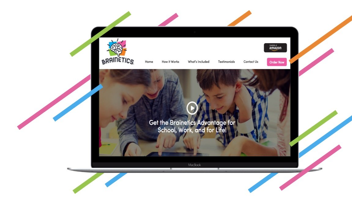

With an integrated, cross-channel strategy, the power of social media was leveraged by producing imagery, curating content, and distributing it across online media channels to build audiences, increase traffic, and drive sales.

Content that excites
Created a suite of social and digital content to help communicate the value of the brand’s product across all channels in a unified and aspirational way. Designed social content to feel bright and exciting to mimic the brand itself and inspire a desire to learn.

It’s not just about publishing cute photos, you have to put thought into what’s the best visual way of representing the brand online. The first thing audience sees when interacting with your brand on social media is your brand’s photos and videos – first, they see the photo, then (if it’s intriguing enough) they read the copy. This is the guiding thought when creating visual guidelines for a brand.

Make it stand out
Whatever it is, the way you tell your story online can make all the difference.
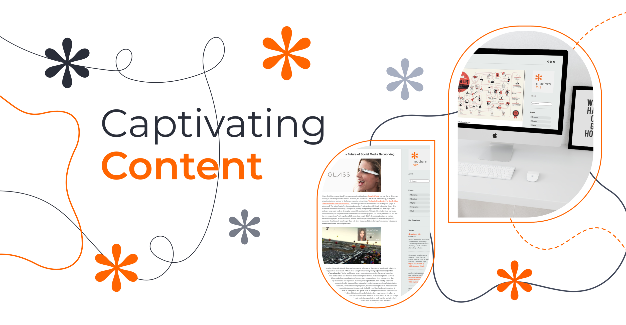
Modern Biz is a marketing and technology blog as well as a creative design showcase. The site's goal is aimed at curating high-quality content and distributing it across various platforms.
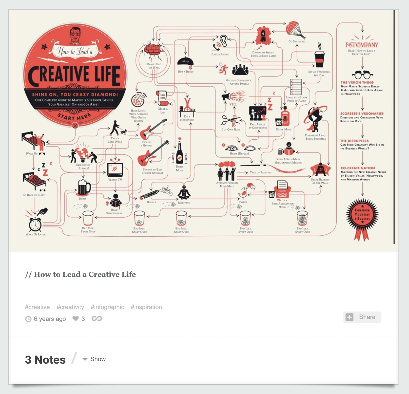
When the client reached out for assistance, the company had already built up a big repertoire of online content over the years. Previously he had used a simple Wordpress theme, which didn’t fit the needs of the website anymore. The main challenge was to restructure the content and replace the old version with a versatile framework that would stand out. To achieve this the platform had to be reshaped fundamentally while still maintaining the connection to the original look and feel.


Crafted a fresh, more immersive, and inspiring brand persona that's both beautiful and impactful.
Modern Biz’s visual identity needed to align with their corporate narrative. Created a fresh modern visual identity that is inspiring and approachable. Every design element was designed with the intent to support Modern Biz’s brand narrative and appeal to current and future customers. A style guide was created to allow the design system to remain consistent across people and teams.
━━
Focus on Engagement
Rich Content Pages
Eclectic Editorial Layout
Community Involvement

Modern Biz has a playful, upbeat vibe that needed to be enhanced but the platform also had to be perceived as highly professional. Nevertheless, content is never boring but entertaining and makes the young audience stay curious. Modern Biz is real and original, providing information in a fun way.

Simple lines, vivid colors, and contemporary styling were the three main guidelines when designing the brand identity for Modern Biz. The brand was designed to look contemporary and minimalist, just like the blog itself.
⎯⎯⎯Minimal doesn't need to be plain and subtle. A bold serif typeface title will make a strong impact when used in a modern and clean design.


With the new design approach, Modern Biz developed into an authentic, unique platform that reached users on an emotional level. The new structure improved content discovery, readability and user engagement.
⎯⎯⎯With blog articles being a priority, the landing page architecture served the purpose of displaying a diversity of various content pieces. This allowed users to easily browse and explore a wide range of topics and remain engaged.


Built a design system that leverages clean, open layouts to house the rich content throughout the site, presenting key pieces of content in a more digestible way. This also provides a more guided experience online, with clear call-to-actions and global elements that help users navigate from page to page.
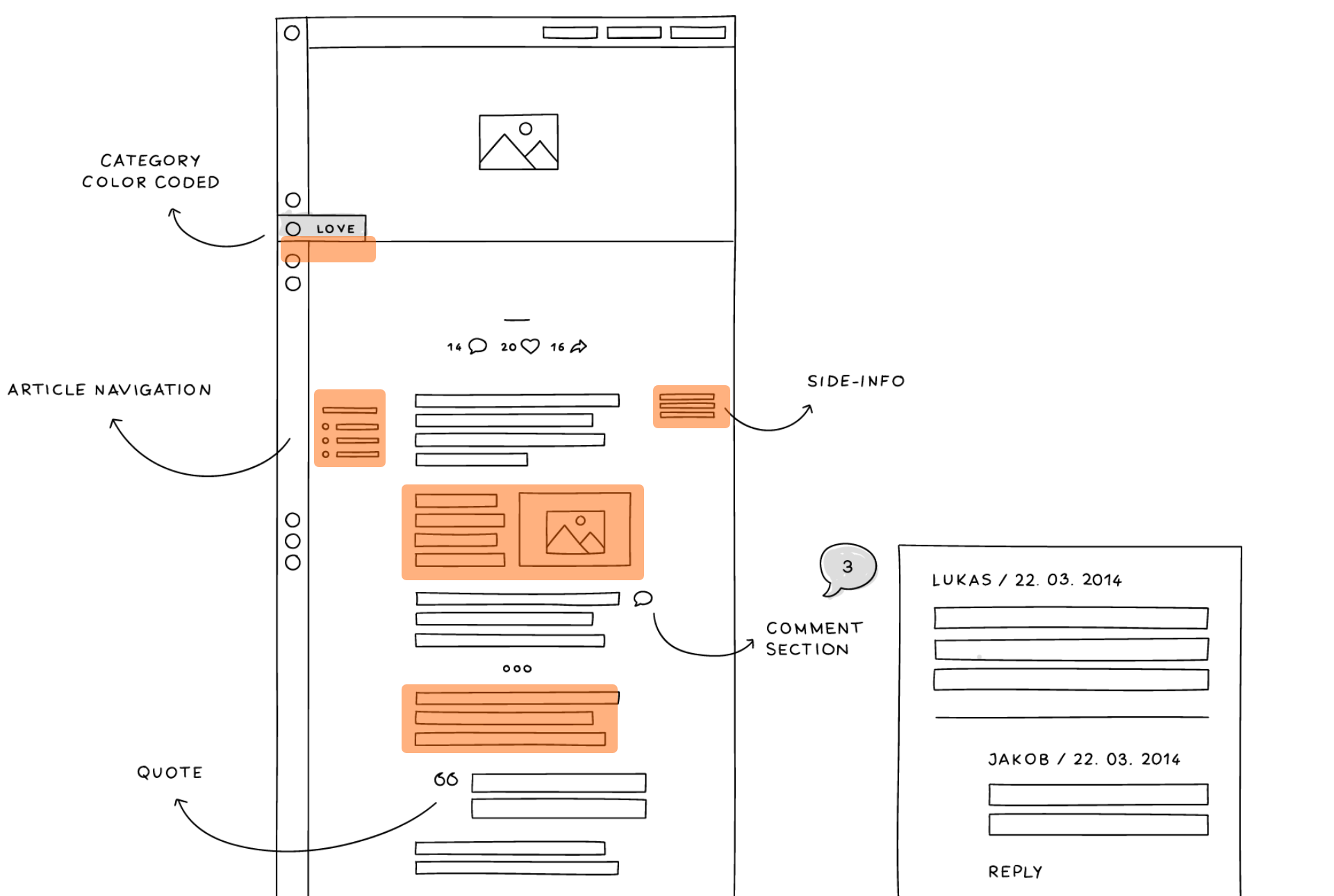

The main goal of the website was to focus on content distribution and highlight important media. As a result, layouts were carefully organized so the website would be fully optimized to distribute content.
⎯⎯⎯The blog at the start before AR Digital Design took over was pretty basic. As a result, we had to overcome a number of technical challenges to include the features we wanted.


A new navigation concept, a modular layout structure, and innovative blog features improved both the content discoverability and the general reading experience.
⎯⎯⎯
Visual content blocks
Gallery slideshows
Embedded videos
Product cross-linking


A custom grid system enabled a seamless cross-device experience. The mobile experience was especially important because of the young target audience who primarily used mobile devices.
⎯⎯⎯
When we started working with Modern Biz, their site had a high page count. Based on website analytics and user research we cleaned the slate and built a new IA from the ground up. At the same time, we created a content strategy centric sitemaps that outlined the purpose of each interface based on Modern Biz’s business goals and customer needs.
⎯⎯⎯Designed to maximize content viewing and allow for easy sharing across social platforms. User experience is seemless and allows the site visitors to effortlessly browse content.




Get in touch via the button below and take a minute to talk about your project.
Let’s talk ➔